
Beware: New Banking Page in QuickBooks Online Confuses
New Banking Page
What has changed
A couple of my clients have pointed out to me recent changes in their QuickBooks Online accounts that is causing confusion and dissatisfaction. Apparently, Intuit changed the look of their Banking page. Unfortunately, as a QuickBooks ProAdvisor, I was not made aware of this update and I participate in the monthly In The Know webinars on QuickBooks Online Updates.
Old Banking Page
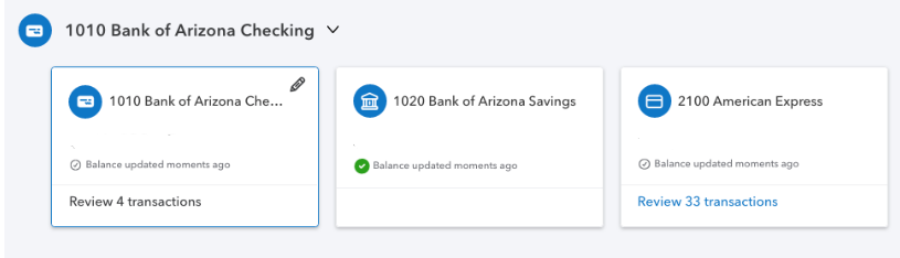
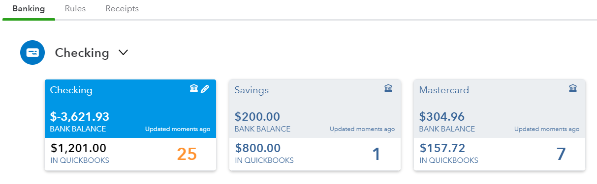
First off, the look of the bank and credit card tiles has changed. The font is a lot smaller; it is so much harder to read. What I have always loved about QBO over QuickBooks Desktop is the use of large fonts, so this is an unwelcome change.
The active tile is just outlined in a thin blue line instead of the having the Bank Balance info highlighted in blue.
The number of transactions to review is much smaller.
There is no differentiation between the In QuickBooks balance and the Bank Balance. It is not clear which balance is even being displayed here.

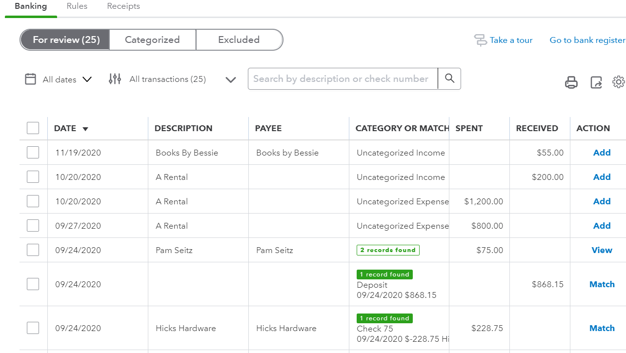
New For Review Grid
Seconly, under the tiles in the For Review section, there have been significant changes, too. While I like the bigger buttons in the Action column (notice how the column title has been removed), their new titles are confusing. The Confirm button especially will cause problems because the Assign To account suggested by QBO is probably wrong. The first reaction is to just click on this button when in reality, the downloaded transaction should be reviewed. I believe the Review button is suggesting an account previously used when adding a downloaded transaction. Both the Review and Confirm buttons really require the same actions from the user: to click and review the correct account, previously known as Add.
Old For Review Grid
Match has glaringly changed too. It has been replaced with the Review button with the number of records found under Category Or Match column, but not highlighted or outlined, making it easier to miss. The word Match made more sense because it confirmed that only one transaction already in QBs matches the one downloaded from the bank or credit card. The old action View meant that there was more than one transaction already in QBs and that you have to click on the transaction to view the drawer that shows the list of transactions that are potential matches to select from.
What you can do
It is not clear whether these are temporary changes or test situations imposed on a select group of accounts or indications of what updates are coming for all QBO accounts. If the latter, I suggest that all QBO users submit feedback to prevent these changes from being implemented. This can be done via the Gear icon and Feedback under Profile. For those accounts that already have these changes, I suggest submitting feedback also so that these updates get rolled back to the older version. Intuit takes feedback submitted this way very seriously.
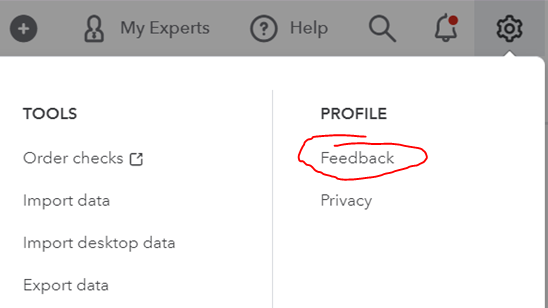
How to submit feedback